Neighborhood Names and it,s crime percentages in pie chart
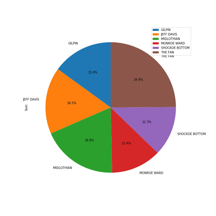
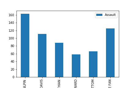
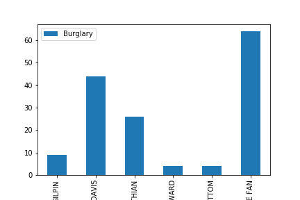
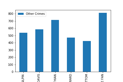
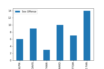
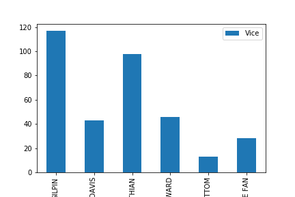
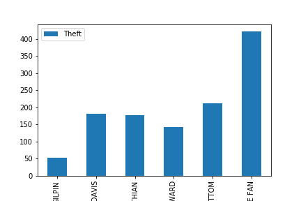
We collected data from Richmond Police Department-Crime Incident Information Centre and created python script to visualize the crimes of six neighborhood with the highest number of crimes within the dataset.
And we built a series of bar charts and a pie chart using Matplotlib in order to showcase the crimes within the neighborhood.Our intent is to create awareness of safety to those reading this should they consider moving to a less crime neighborhood within our dataset.
Visualizations